Flexbox Layout
published on 2020-03-26
1. What is Flexbox Layout?
Any container (parent element) can be specified as Flex layout
.container {
    dispaly: flex; // display defines a flex container
}
inline element can use Flex layout
.container{
  display: inline-flex;
}
⚡️⚡️⚡️ After setting to Flex layout, the float, clear, and vertical-align attributes of the child elements will be invalid.
2. Basic Concept
Elements that use the Flex layout are called Flex containers, or "containers" for short. All its child elements automatically become members of the container, called the flex item, referred to as "item".
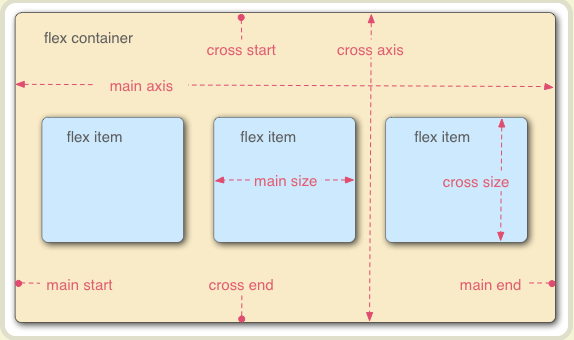
The container has two two axes: main axis and cross axis. The items will be laid out following either main axix or cross axis
3. The properties of container
    * flex-direction
    * flex-wrap
    * flex-flow
    * justify-content
    * align-items
    * align-content
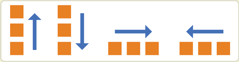
flex-direction: it decide the direction of main axis
.container {
    flex-direction: row | row-reverse | column | column-reverse;
}
flex-warp
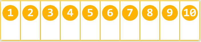
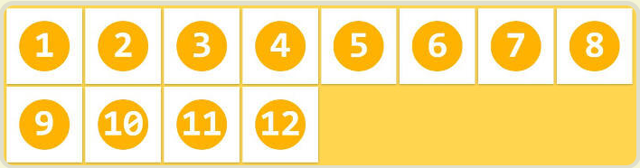
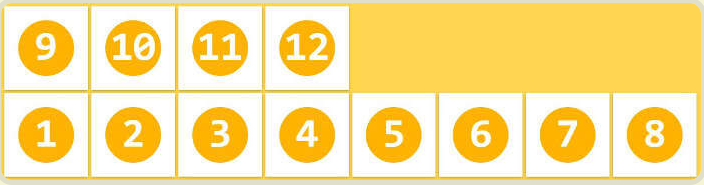
All the flex items will be laid onto one line by default. But you can change that with flex-wrap when items beyond axis.
.container {
     flex-wrap: nowrap | wrap | wrap-reverse;
}
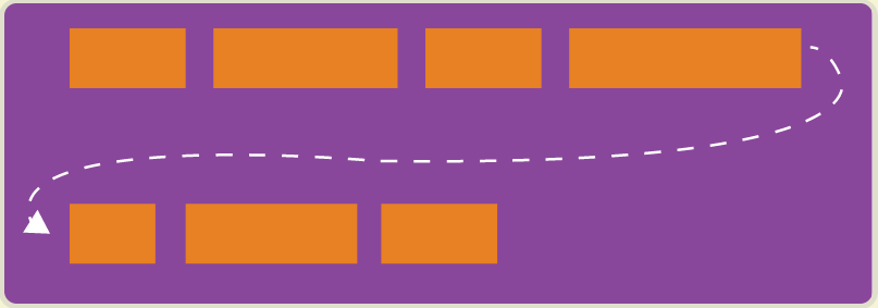
The property has 3 value:
1. nowrap(by default): all flex items will be on one line
2. wrap: flex items will wrap onto multiple lines, from top to bottom.
3. wrap-reverse: flex items will wrap onto multiple lines from bottom to top.
flex-flow
It is a shorthand for the flex-direction and flex-wrap.
.container {
    flex-flow: <flex-direction> || <flex-wrap>;
}
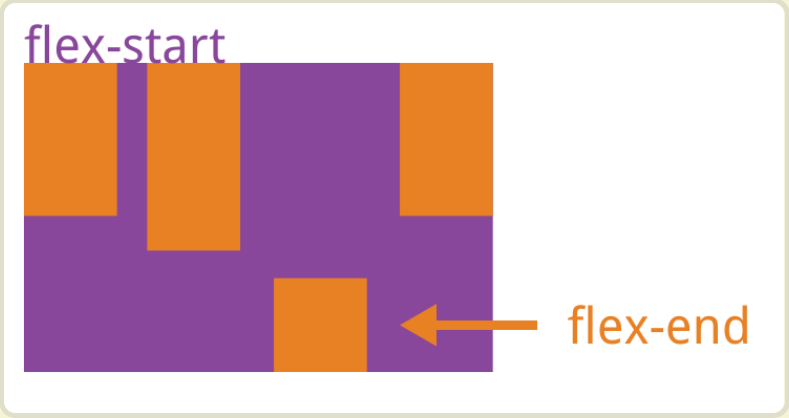
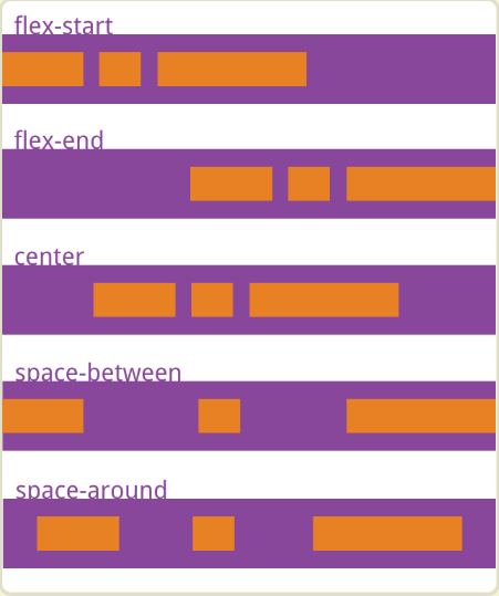
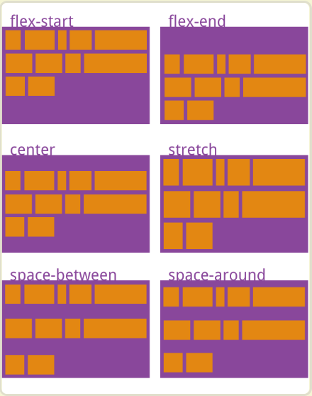
justify-content
It defines the alignment along the main axis .
.container {
    justify-content: flex-start | flex-end | center | space-between | space-around;
}
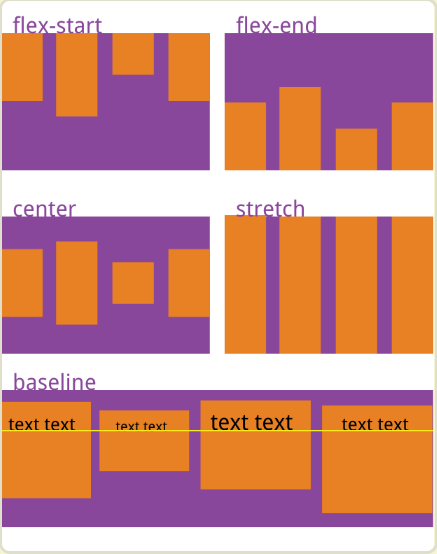
align-items
It defines how the flex items are laid out along cross axix on the current line.
.container {
    align-items: flex-start | flex-end | center | baseline | stretch;
}
(Assum the directon of cross axis is top to buttom)
align-content
It defines the alignemnt of multi-line flex items in cross axis.
⚡️⚡️⚡️ Note: this property has no effect when there is only one line of flex items.
.container {
    align-content: flex-start | flex-end | center | space-between | space-around | stretch;
}
4. The properties of item
    * order
    * flex-grow
    * flex-shrink
    * flex-basis
    * flex
    * align-self
order
It defines the order of items. The smaller the value, the higher the arrangement. It's 0 by default.
.item {
    order: <integer>
}
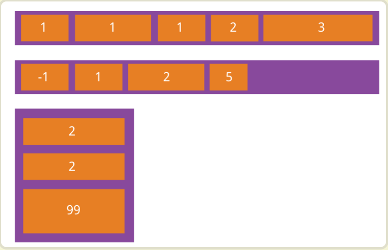
flex-grow
It defines the ability for a flex item to grow if necessary. The value is 0 by default. That is, if there is space left, it will not be enlarged.
.item {
    flexp-grow:<number>
}
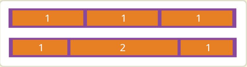
If the flex-grow of all items is 1, they will divide the remaining space equally (if any). If the flex-grow of an item is 2 and all other items are 1, the former will occupy twice as much remaining space as the other items.
flex-shrink
.item {
    flex-shrink: <number> // default 1
}
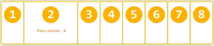
⚡️⚡️⚡️ Note: Negative numbers are invalid.
flex-basis
It defines the default size of an element before the remaining space is distributed.
.item {
 flex-basis: <length> | auto; // default auto
}
flex
It is the shorthand for flex-grow, flex-shrink and flex-basis combined. ⭐️⭐️⭐️ Related Article
.item {
 flex: none | [ <'flex-grow'> <'flex-shrink'>? || <'flex-basis'> ]
}
align-self
The align-self allows a single item to have a different alignment than other items, and can override the align-items.
.item {
 align-self: auto | flex-start | flex-end | center | baseline | stretch;
}