Master Thesis-Development of visualization methods for a comparison-based recommender system
published on 2020-01-09
Abstract
Product comparison tools are often used in online retailing, where also recommender systems are very popular. Nonetheless their effects and possible benefits on the decision-making stage during the recommending process have never been studied and no proper research has been conducted about their combination. Besides, although there is a whole research field regarding information visualization, there are open questions regarding the best way to present the product space (to ease the exploration and understanding of the whole set of recommended items) and individual product properties (to individually decide for the best option) when using a comparison tool. To research these questions, a novel concept of a comparison-based recommender system is introduced in this paper. It concentrates on two visualization levels: whole product space and individual items. For the first level, a 2D bubble chart and a 3D map-based visualization are applied to present a set of recommended items. For the second level, two different approaches for single attribute comparison are available: relative differences and absolute values. To assess the validity of the approaches, a prototype for a shopping site was developed and implemented based on the aforementioned comparative visualizations. Finally, a user study was conducted. The results indicate the comparison tools have a positive effect in the RS area.
Thesis Approach
Various visualization techniques are now available on the Internet. These comparative visualization methods are used in the fields of medicine, commerce, transportation, etc. to help people discover differences between objects. The process of discovering discrepancies involves finding the relationships between objects. To better design the comparison tools used in the recommender systems, a pre-study of comparative visualization techniques was conducted. This thesis takes into account the products to be compared, the number of recommendations and the complexity of the items and then devised several visualization methods that be benefificial in comparing products and contributing to the decision-making.
-
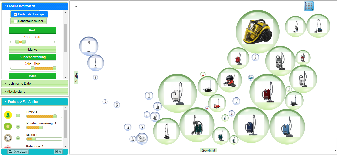
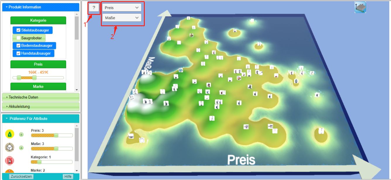
The first one is related to the visual representation of product space. The product space refers to the whole set of recommended items, which can be very large and difficult to explore. For such a scenario, I use a 2D bubble chart and 3D map, which are the best results of pre-study, to provide the users with an overview of all recommendations. In addition, both methods still visually show the basic discrepancies between the items.
- 2D Bubble Chart: When a recommender system recommends a set of items based on a user’s preference, the recommendations are represented by the bubbles with product images. Products are displayed in a 2D bubble chart. The x and y axes of the bubble chart are the numeric attributes that users want to compare. Each item on both axes is arranged from small to large according to the value of features. So the users can not only see the recommended products, but also intuitively know the difference between the items from their location and distribution. Besides, the color of bubble represents if a product satisfifies filtering conditions. The size of a bubble indicates how well each item meets a user’s preferences.

- 3D Map: It is similar to 2D bubble chart, but the recommended items are displayed on a 3D map. In addition to giving a comparative meaning on the x-axis and y axis, the elevation of the map’s surface is used to indicate how much each recommended item meets the users’ preferences. The color of the surface is changed with the users’ preferences. Furthermore, it supplies interaction with product space through rotate, zoom, drag.
- 2D Bubble Chart: When a recommender system recommends a set of items based on a user’s preference, the recommendations are represented by the bubbles with product images. Products are displayed in a 2D bubble chart. The x and y axes of the bubble chart are the numeric attributes that users want to compare. Each item on both axes is arranged from small to large according to the value of features. So the users can not only see the recommended products, but also intuitively know the difference between the items from their location and distribution. Besides, the color of bubble represents if a product satisfifies filtering conditions. The size of a bubble indicates how well each item meets a user’s preferences.
-
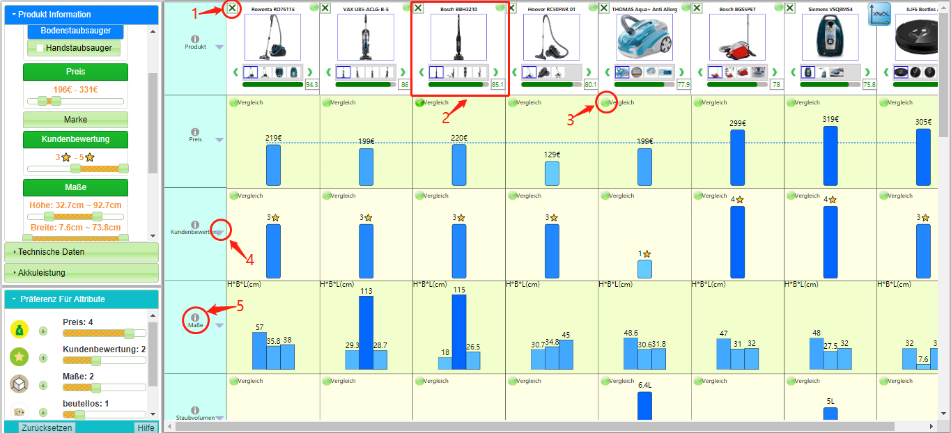
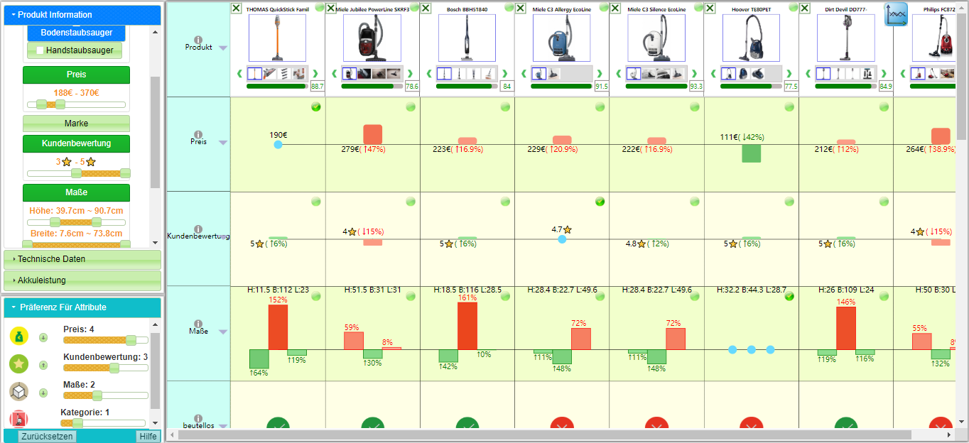
The second part is the visualization of product properties. The items’ attributes are displayed side by side in a dynamic table using two visualization methods: relative difference visualization and absolute value visualization.
-
Dynamic Table: The so-called dynamic comparison table uses rows to represent item properties, columns to represent products. The users can select some products from product space for comparing and these items will be dynamically added to the table. Besides, interactive functions that assist in comparing are provided, such as sorting items based on a specific attribute, deleting items. As the users’preferences change, the order of the properties will change dynamically. Faced with numerous attributes, some that are important to the users will be displayed in prominent locations.
-
Absolute value visualization: Values are represented side by side by a verticalbar chart in a dynamic table. The height of rectangular bars is proportional to the values. Besides, the color of the bars (from dark to light) is also mapped to the size of the values (small to large).
-
Relative difference visualization: The relative difference represents the percentage increase or decreases of values compared to a baseline. The baseline can be chosen dynamically by users. The percentage is displayed side by side by a vertical positive or negative bar in a dynamic table. In order to highlight the difference between the ratios, the technique of color-coding is also applied to show the rectangular bars.
-
System's Architecture
The web-based application prototype includes a recommender system with a comparison tool. The system recommends items according to user preferences which are collected explicitly from users' interaction with the features filter. Then the comparison tool displays the set of recommended items using of the previously designed visualizations. The whole system's architecture is below:
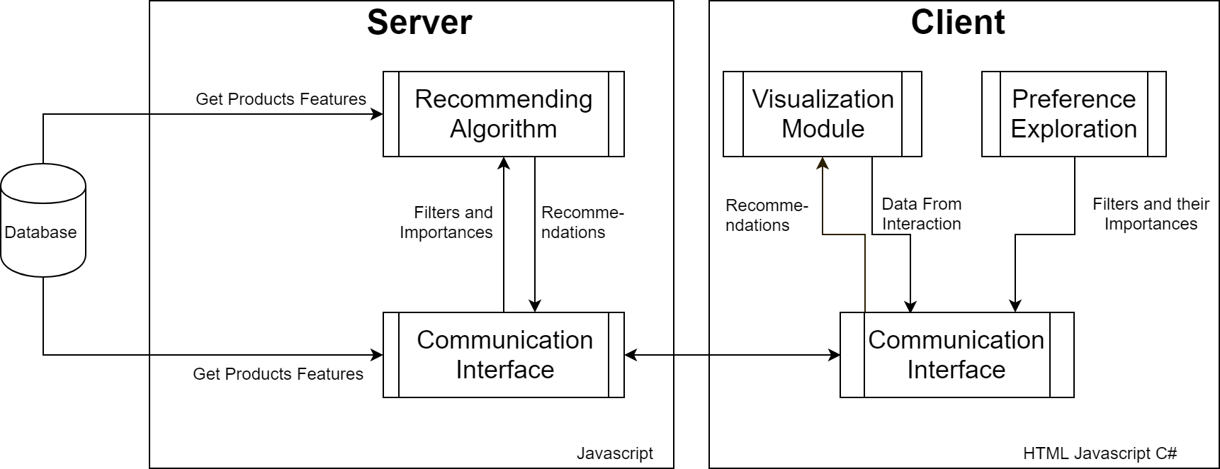
Used Technologies
The server is built using Node.js. It is a runtime environment for JavaScript based on ChromeV8 engine. Node.js uses an event-driven, asynchronous I/O model. It is used to build fast, easy-to-expand web applications easily.
The server is also connected with a database, which is developed using MySQL. MySQL is a relational database management system. Relational databases store data in separate tables instead of place all of the data in a large repository, which increases speed and flexibility. The SQL language used by MySQL is also the most commonly used standardized language for
accessing databases.
Besides, XAMPP is used to manage and deploy databases easily. XAMPP is a powerful integration package includes Apache, MySQL, PHP and PERL. This thesis only uses its MySQL and corresponding management page.
The webpages in the client were created using JQuery, D3.js, HTML,CSS, Bootstrape and Unity. jQuery is a fast, simple and clear JavaScript framework. It wraps the commonly used JavaScript functions and provides a design pattern that optimizes HTML document manipulation, event handling, animation design, communication and user interaction. D3.js is similar to JQuery, it is a JavaScript library to manupulate web documents. But it’s advantage to draw custom shapes and graphs based on the data.
Unity is a multi-platform (including web platform) game engine. Developers can use it to create such as 3D video games, 3D animations, VR projects and 3D web applications. In this thesis, it is used to create the 3D Map.
Links
- Presentation
- [Youtube]