Example of Flex layout
published on 2020-03-28
👍 Recommended articles: Landon Schropp and Solved by Flexbox
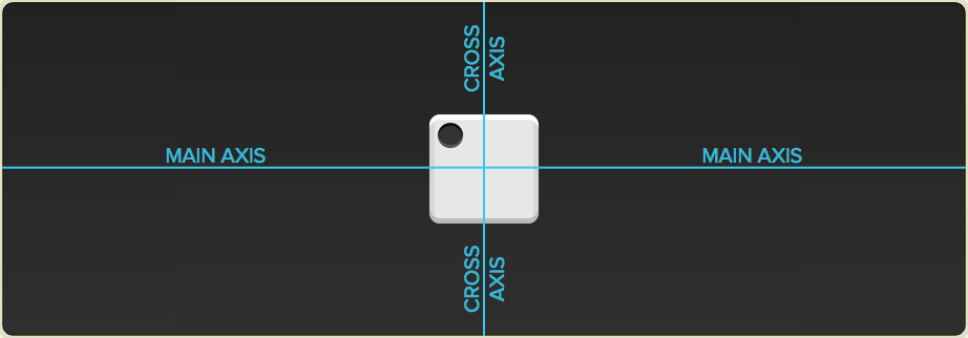
The layout of dice
Let us start: The HTML template is 👇 . div element (represents one side of dice) is flex container. span element (represents a spot) is flex item.
<div class='container'>
    <span class='item'></span>
</div>
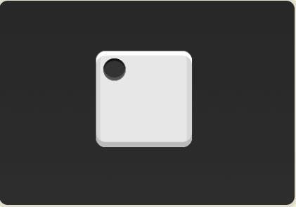
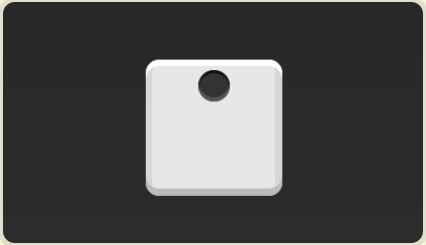
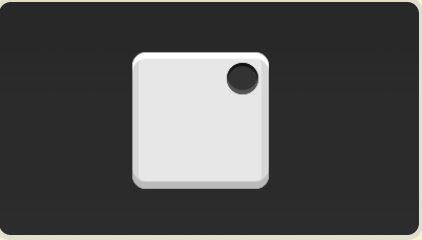
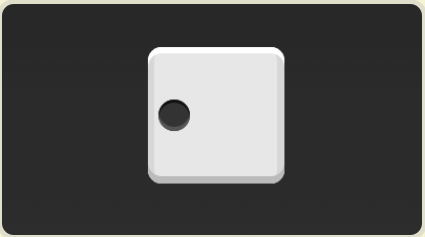
1. One item (only one pot on one side of dice )
1.1
   .container {
       dispaly: flex;
   }
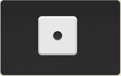
1.2
.container {
    display: flex;
    justify-content: center;
}
1.3
.container {
    display: flex;
    justify-content: flex-end;
}
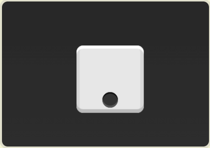
1.4
.container {
    diaplay: flex;
    align-items: center;
}
1.5
.container {
    display: flex;
    align-items: center;
    justify-content: center;
}
1.6
.container {
    display: flex;
    justyfy-content: center;
    align-items: flex-end;
}
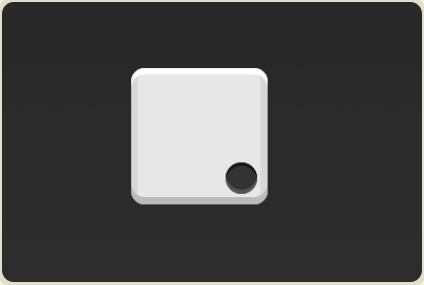
1.7
.container {
  display: flex;
  justify-content: flex-end;
  align-items: flex-end;
}
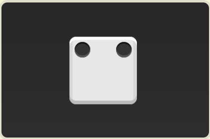
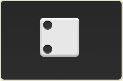
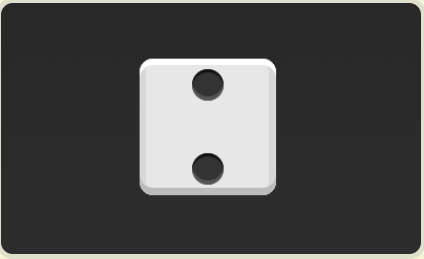
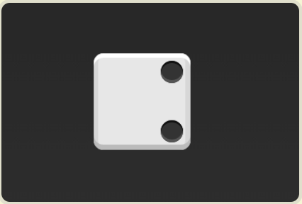
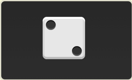
** 2. Two items **
2.1
.container {
    display: flex;
    justify-content: space-between;
}
2.2
.container {
  display: flex;
  flex-direction: column;
  justify-content: space-between;
}
2.3
.container {
  display: flex;
  flex-direction: column;
  justify-content: space-between;
  align-items: center;
}
2.4
.container {
  display: flex;
  flex-direction: column;
  justify-content: space-between;
  align-items: flex-end;
}
2.5
.container {
  display: flex;
}
.item: nth-child(2) {
  align-self: center;
}
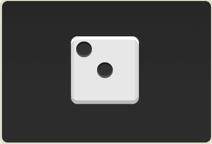
2.6
.contaienr {
  display: flex;
  justify-content: space-between;
}
.item:nth-child(2) {
  align-self: flex-end;
}
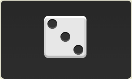
** 3. Three items **
.container {
  display: flex;
}
.item:nth-child(2) {
  align-self: center;
}
.item:nth-child(3) {
  align-self: flex-end;
}
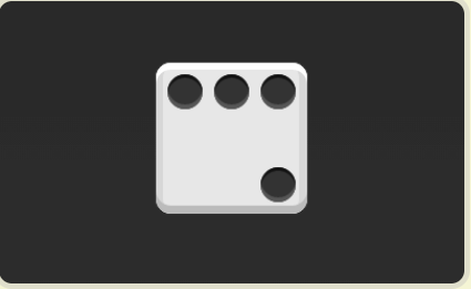
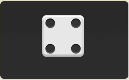
** 4. Four items **
4.1
.container {
  display: flex;
  flex-wrap: wrap;
  justify-content: flex-end;
  align-content: space-between;
}
4.2
(CSS)
.box {
  display: flex;
  flex-wrap: wrap;
  align-content: space-between;
}

.column {
  flex-basis: 100%;
  display: flex;
  justify-content: space-between;
}
(HTML)
<div class="box">
  <div class="column">
    <span class="item"></span>
    <span class="item"></span>
  </div>
  <div class="column">
    <span class="item"></span>
    <span class="item"></span>
  </div>
</div>
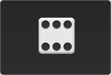
** 5. Six items **
5.1
.container {
  display: flex;
  flex-wrap: wrap;
  align-content: space-between;
}
5.2
(CSS)
.box {
  display: flex;
  flex-wrap: wrap;
}
.row{
  flex-basis: 100%;
  display:flex;
}

.row:nth-child(2){
  justify-content: center;
}
.row:nth-child(3){
  justify-content: space-between;
}
(HTML)
<div class="box">
  <div class="row">
    <span class="item"></span>
    <span class="item"></span>
    <span class="item"></span>
  </div>
  <div class="row">
    <span class="item"></span>
  </div>
  <div class="row">
     <span class="item"></span>
     <span class="item"></span>
  </div>
</div>
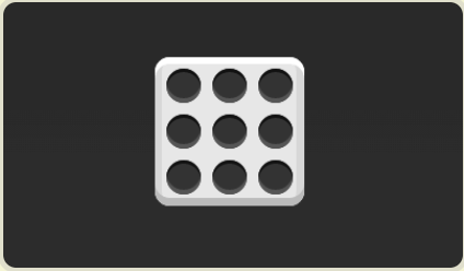
** 6. Nine items **
.container {
  display: flex;
  flex-wrap: wrap;
}
The grid layout
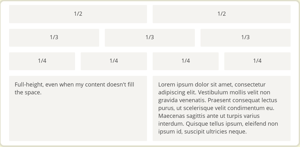
** 1. The basic grid layout **
The simplest grid layout is evenly distributed. The space is evenly distributed in the container, just like the dice layout above. But you need to set the automatic scaling of the items.
HTML is 👇
<div class="Grid">
  <div class="Grid-cell">...</div>
  <div class="Grid-cell">...</div>
  <div class="Grid-cell">...</div>
</div>
CSS is 👇
.Grid {
  display: flex;
}
.Grid-cell {
  flex: 1;
}
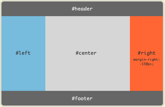
** 2. Holy Grail Layout **
HTML is 👇
<body class="HolyGrail">
  <header>...</header>
  <div class="HolyGrail-body">
    <main class="HolyGrail-content">...</main>
    <nav class="HolyGrail-nav">...</nav>
    <aside class="HolyGrail-ads">...</aside>
  </div>
  <footer>...</footer>
</body>
CSS is 👇
.HolyGrail {
  display: flex;
  min-height: 100vh;
  flex-direction: column;
}
header,
footer {
  flex: 1;
}
.HolyGrail-body {
  display: flex;
  flex: 1;
}
.HolyGrail-content {
  flex: 1;
}
.HolyGrail-nav, .HolyGrail-ads {
  /* The width of the two sidebars is set to 12em */
  flex: 0 0 12em;
}

.HolyGrail-nav {
  /* nav part is in the far left */
  order: -1;
}
If the screen is small, the three columns in the body automatically become stacked vertically.
CSS is 👇
@media (max-width: 768px) {
  .HolyGrail-body {
    flex-direction: column;
    flex: 1;
  }
  .HolyGrail-nav,
  .HolyGrail-ads,
  .HolyGrail-content {
    flex: auto;
  }
}